First I wanted to create a simple linear regression, plotting the number of flights and the number of delays in the SES area (RP1-RP2), for the period of years 2016-2019. I extracted the data from the EUROCONTROL datasets – Daily IFR traffic and en-route ATFM delay by entity and delay cause (FIR based) and Monthly IFR traffic and en-route ATFM delay by entity and delay cause (FIR based).
The linear regression in monthly data was interesting, with R-squared value of 0.6932.

However, when I plotted the daily data, the with R-squared value of just 0.2742.

The difference in R-squared values between the monthly and daily data suggests that the frequency or granularity of the data can have a notable impact on the performance of linear regression models.
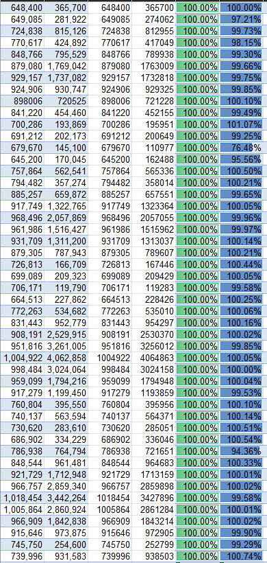
To verify that the data are matching, I aggregated the daily data in a pivot table and than compared the results:
Bonus: Here I want to compliment how easy it is to add a colour element to the scatter chart in Tableau, with just few clicks. In Excel doing something like this would be quite eleborate.
